Home

Showing posts with label CAS. Show all posts

Monday, February 6, 2012

Have a Heart

The Clean and Simple (CAS) challenge on Splitcoaststampers today is to use hearts in your design.  I came up with these two using heart Nestabilities:


My base color choices for both cards were pink pirouette and very vanilla.  I also used some retired Stampin' Up designer paper on both cards.

On the card above, I stamped I {Heart} Hearts on the vanilla base cardstock and sponged the outer edges with the pink pirouette.

On the card below, I didn't use any stamps or inks, only my heart Nestabilities, which cut the small heart out of felt really well.  I also love my new embossing folders from Stampin' Up's Adorning Accents. 


Thanks for your visit and comments today!  I appreciate them!

Monday, January 30, 2012

Home is Where...

...the heart is, for sure!

The Splitcoaststampers' CAS challenge is a beautiful inspiration photo this week.  I stamped the trees first, masked them, stamped the clouds, and then sponged the sky and ground.  I stamped the house onto kraft cardstock with Cherry Cobbler ink, cut it out, and applied to my scene.


My card is 4 1/4" square. After I cut out the image with a square Nestie, I got the idea to also cut/emboss with a circle Nestie within the square. I used a large square Nestie to help me line up the dotted outline frame with my black marker.  And before you get the impression that I can draw those lines perfectly straight, I used a template my friend, Joanne, gave me a year or so ago called Stitch, Doodle, Dot.  I love that thing!

Have a great day, friends!

Monday, January 23, 2012

Tweet Colors

I had a wonderful birthday yesterday and would like to thank those of you who took the time to send me a Happy Birthday message!

I love the colors of pink, celery, and white together, which is the Clean and Simple (CAS) challenge on Splitcoaststampers.  I used punches for everything in my design with the exception of the sentiment and the bird's legs which I drew.


My punch-around-the-page one of many items in my birthday package from my sweet friend, Joanne.  Isn't it pretty?  I hand cut grass and then embossed it with an embossing folder for additional texture.  The birds were made with various circle punches, a bird wing punch, and a heart punch.  The "Tweet" sentiment is from a There She Goes Stamp set.

Monday, January 9, 2012

CAS and Die Cuts

 Jen, challenge hostess of the Clean and Simple Winter Design Team on Splitcoaststampers, challenged the DT members to make a CAS card using die cuts.  I used:

1.  Flower Pot Nestability (Spellbinders)
2.  Flower Die-namics (My Favorite Things)
3.  Button Sizzlits Die (Stampin Up)

My colors are Elegant Eggplant, More Mustard, Cherry Cobbler, and Always Artichoke....all from Stampin' Up's designer pack.  I popped up the button centers with thick dimensionals.

Come on over and play along!

Monday, January 2, 2012

Happy New Year!

Happy New Year!!!  I hope you had a fabulous time celebrating the new year. 

Hubby and I typically stay home watching movies on New Year's Eve.  Just a few minutes before midnight, we fill our champagne glasses and set up the video camera on a tripod to videotape ourselves ringing in the new year with the New Year's Eve countdown on TV!  It's fun watching the compiled years my husband puts together and seeing the little changes from year to year.

For the Clean and Simple challenge on Splitcoaststampers this week, Jen challenged the design team and you, too, to make some type of project with a beverage theme.  Seeing that it's the new year, I went with martinis!!!


I used acetate for the liquid in my martini glasses. I used a red Copic marker to color the pimento on my olives, which are green brads.  Here's a closer view of the gold embossed glasses.  The swizzle sticks are toothpicks.


Here's a complete list of the supplies I used:
Stamps: Martini glass and Happy New Year sentiment by Rubbernecker
Paper: Whisper White, Cherry Cobbler, Black, acetate
Ink: none
Accessories: gold embossing powder, versamark, olive green brad, red Copic marker, gold cord, embossing folders, dimensionals, toothpick


Here's wishing YOU a happy, healthy, and prosperous New Year!  Thanks for stopping by!

Sunday, December 11, 2011

Chillin Out

When I saw these adorable penguins building a snowman image, I knew I needed to add them to my collection of stamps! 


Three of my penguins were stamped twice, cut out, and popped up. I added liquid applique to the falling snow. For the snow beneath the penguins, I sprinkled dazzling diamonds onto the wet liquid applique and then heat set it. Added the falling snowflakes from MS Punch Around The Page snowflake punch. Did some doodling and called it good!

Here's a closer view of the popped-up penguins and the liquid applique snow.


Monday, November 21, 2011

Lazy, Lazy!

I must admit to laziness occasionally when it comes to posting my creations to my blog.  I'm pretty good about uploading them to my Splitcoaststampers' gallery.  Sometimes it's all about lack of time to keep up with both and sometimes I honestly wonder if it's worth all the work to maintain a blog.  My days just get away from me with all the things to do, and I just don't get all the time I'd like to visit and comment on the blogs of my stamping friends.  If I've missed yours lately, I do apologize.  Too bad I don't have a Mini Me who I could assign this task to---ha!  ha!  Seriously, I know how much I value the input I receive, so I really do try to support my blogging friends as much as possible.  Anywhooo, here are three creations I've made in the past couple days.  I've also been designing some clean and simple gift sets for a customer that I'll share with you soon.

First up is a very clean and simple (CAS) card I made for submission to the Winter CAS design team.  Our challenge was to use designer paper and ribbon.  I stamped my butterfly onto this pretty polkadotted designer paper and punched it out with my butterfly punch.  I added the 1/8" black/white tafetta ribbon for it's body and silver cord for the antennae.  This card is actually one of five that I made for one of the gift sets I referenced above.  (Stamp set used is Flight of the Butterfly by Stampin' Up).


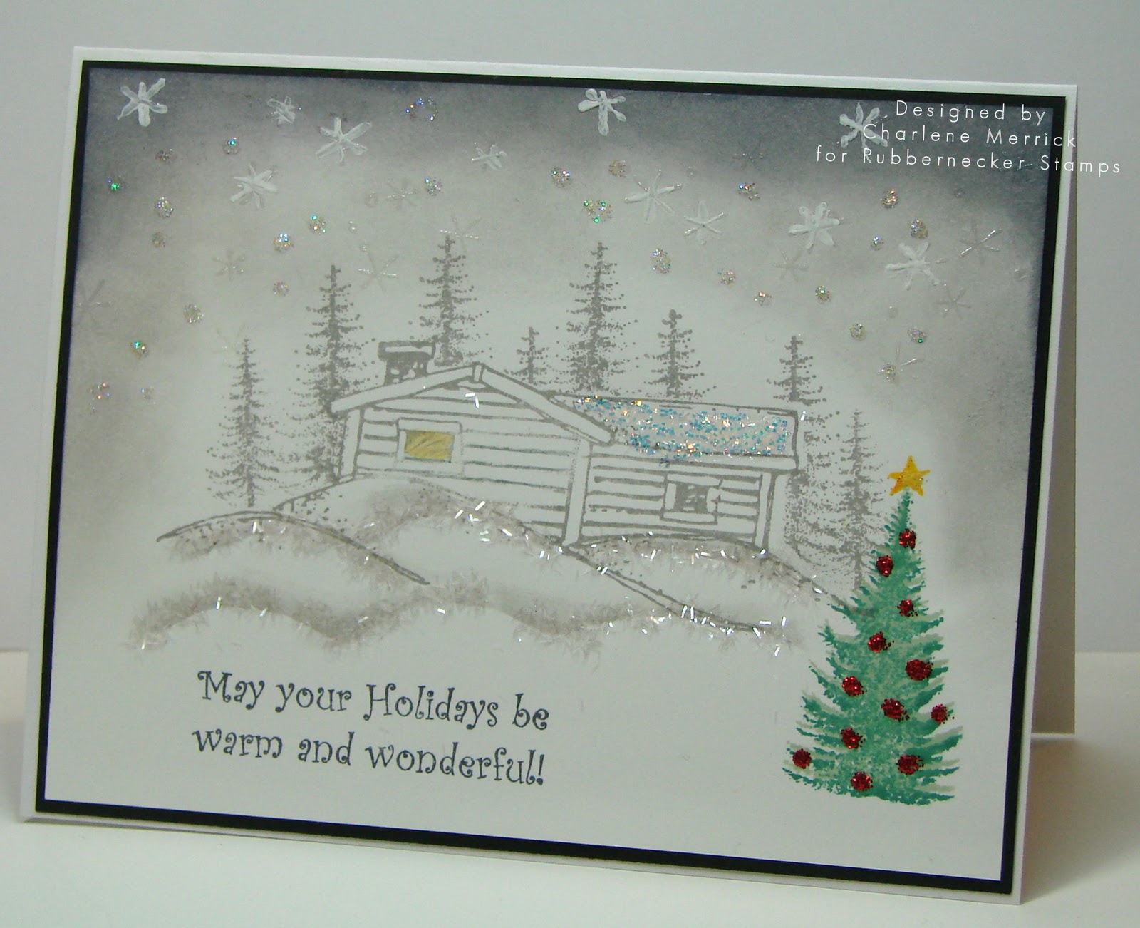
I love the challenges at Splitcoaststampers as they help to get my creative juices flowing.  My friend, Joan, challenged us technique lovers to make a card using snow.  I went with a gray tone card with just the one splash of color for the tree in front.  In real life, it sparkles and has a soft glow to it.  I stamped the images in Going Gray and sponged Going Gray and Basic Gray for the sky.  I used Martha Stewart Tinsel Glitter for the snowy hills, and added red stickles for the ornaments on the green tree.  I also used icicle stickles for the roof top and some of the falling snow in the sky.  (Stamps used are The Moose is Loose Kittie Kit and Christmas Phrase Set by Rubbernecker).


My third card is one I made as a guest designer for the color challenge on Splitcoaststampers.  We were given the colors of Marina Mist, Pear Pizzaz, and Blushing Bride with a dessert option to make a Christmas card.  Well, I obviously forgot about the dessert option, but I suppose I could still use this for a non-traditional Christmas card.....maybe????   I had to substitute Blush Blossom for Blushing Bride. I did add just a hint of Pink Pirouette to my Blush Blossom watercoloring because Blushing Bride looks like it has more of a pink cast to it. I also don't have Pear Pizzaz so I used a mixture of Certainly Celery and Old Olive to get as close to Pear as I could. I used Glossy Accents on the Embrace bloom after I was done watercoloring.


You may have noticed that these cards are all pretty clean and flat.  I'm trying to be better about not adding too much bulk to my cards because they are easier (and less expensive) to mail that way.  (Stamp set is used an oldie, but goodie called Embrace Life by Stampin' Up).

That's it for now as I need to get some beauty sleep.  Thanks for visiting and your comments.  I really do appreciate them!

Friday, August 27, 2010

Krafty Butterfly


A quick post this morning.  I made this for the SCS Clean & Simple challenge to use the colors kraft, turquoise, and white in our design.  I need some simplicity in my life, so making clean and simple cards fits that bill!!  Isn't this ric rac border punch cool?  Should help me save a few dollars by not having to buy ric rac ribbon!

I hope you'll swing by my blog tomorrow as I'll be participating in the Stamp TV CSS Alumni blog hop, and the crew has some awesome projects to show you!

Stamps:  Flight of the Butterfly (Stampin' Up)
Cardstock:  Kraft, Tempting Turquoise, Whisper White
Ink:  Tempting Turquoise, Memento Black
Accessories:  ric rac border punch, turquoise button, hemp cord, pop-up glue dot

Monday, July 5, 2010

Paper and Vellum Posie

Hello, dear friends!  Thanks for stopping by my blog today.  I hope those of you who celebrated Independence Day yesterday enjoyed your day.  We had fun by having family over on Saturday for a cookout and to celebrate June and July birthdays.  It was such a beautiful day weather wise for us.  We had clear, blue skies with warm temperatures accentuated with a light breeze to keep us comfortable as we sat outside. 

Anywhooo, as a result of the holiday, I have today off from work, and I plan to make cards!  The first card I completed today is for two challenges on Splitcoaststampers:  (1)  the Clean and Simple challenge to choose one of the outrageously beautiful wedding cakes from Carrie's CakesHere's the cake I chose because I love black and white accented by pink; and  (2)  the Technique challenge to make our own paper posie.  Here's my card:


I used my 1/4" circle punch on black cardstock to add the larger dots to my dotted paper, and I cut 3/4" strips of black cardstock for the stripes on the top layer.

and here's a couple close ups of the flower I made:


And, if you're interested in knowing how I made my posie, here are the parts I used to make it:


Supplies:  vellum punched with the five-petal flower punch and one of the boho blossoms flowers embossed with dotted swiss embossing folder; regal rose cardstock punched with the scalloped circle and the 1/4" circle; pink glitter; glitter glue; barely banana brad. 

The vellum and cardstock was sponged with regal rose ink on the outer edges.  You can see in the photo how I cut slits between every two scallops on the regal rose cardstock.  This helps with shaping your card once you're ready to put it together.  The vellum five-petal flower petals were folded upwards with my bone folder and then just the tips bent backward to shape them.  For the little boho blossoms piece, I added tiny dots of the glitter glue and applied the pink glitter for a bid of sparkle.

I'm off to do some more creating.....possibly using stamps this time!.....and plan to stop by your blogs later to see what you've been up to!

Tuesday, March 9, 2010

Love for Lindsay

I made this quilt-like card for several challenges. Betty and Cindy are combining the Color and Teapot Tuesday challenges today.  Mothermark's Teapot Tuesday challenge can be seen here for the full story. Betty's color challenge is to use Bashful Blue, Certainly Celery, and Melon Mambo (Pink Passion), and Jen's CAS challenge from yesterday to layer two different shapes (mine are octagons and hearts). Most importantly, I made this card for Lindsay. You can read about Lindsay's story in the Love for Lindsay thread on Splitcoast.


I stamped, cut, and layered three of the hearts. I don't have Pink Passion dp, so I used some of my background stamps for those two panels. I also used my ScorPal to score the background for a quilt-like effect.

Thanks for looking and won't you consider playing today and sending Lindsay some much needed love and encouragement?